
Inconclusive is what describes this “season” the best. I gave my situation time, and more time and it continued to get slowly better. Never got it bad enough to really call it quits, and after Read more…
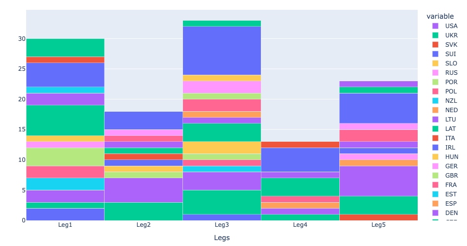
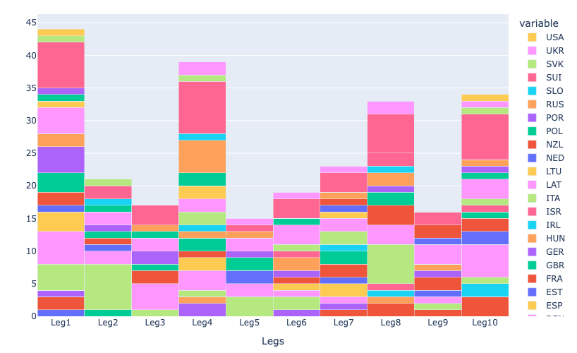
Training starts to feel like (actual) training again. I train some acceptable amounts of hours and also some intensity again and am finally getting the feeling of “accomplishing” something in my everyday training again. A Read more…
It has been two months since the last posts and besides time not much has changed. Things have not gone worse but on the other hand without a diagnosis and treatment it is difficult to Read more…
0 Comments